
Aiero
WordPress Theme
01. Hello!
Hello! Thank you for purchasing our theme. This manual will step by step guide you into getting a copy of our demonstration web-site (https://demo.artureanec.com/themes/aiero) hosted on our own server as well as answer some of the most frequently asked questions by our users.
02. Theme Requirements
To use Aiero, make sure your hosting provider is running the following software:
- WordPress 5.7 or higher.
- PHP 5.6 or greater. WordPress officially suggests to use PHP 7.2.
- MySQL 5.6 or greater.
- PHP modules: php-xml, php-dom and XMLReader.
Recommended PHP Limits
All the issues that you may run into such as: white screen, demo content fails when importing, empty page content and other similar issues are all related to low PHP configuration limits. The solution is to increase the PHP limits. You can do this on your own, or contact your web hosting provider and ask them to increase those limits to the following minimums:
                        memory_limit = 512M

                        post_max_size = 512M

                        upload_max_filesize = 500M

                        max_input_time = 1000

                        max_execution_time = 1000
Please bear in mind that in order to set limits or change your PHP version you or your hosting provider must have access to server settings and php.ini file.
03. Quick Start guide
Let’s begin by making sure that you have a recent version of WordPress. If you don’t, you can find an installation guide at the following address: https://wordpress.org/support/article/how-to-install-wordpress/
First download a zip-archive containing the theme from ThemeForest. Inside the archive you will find another archive, called aiero.zip Extract this archive into a convenient location, then proceed to installing the theme. You can achieve this in two ways:
-
Installation with built-in WordPress tools.
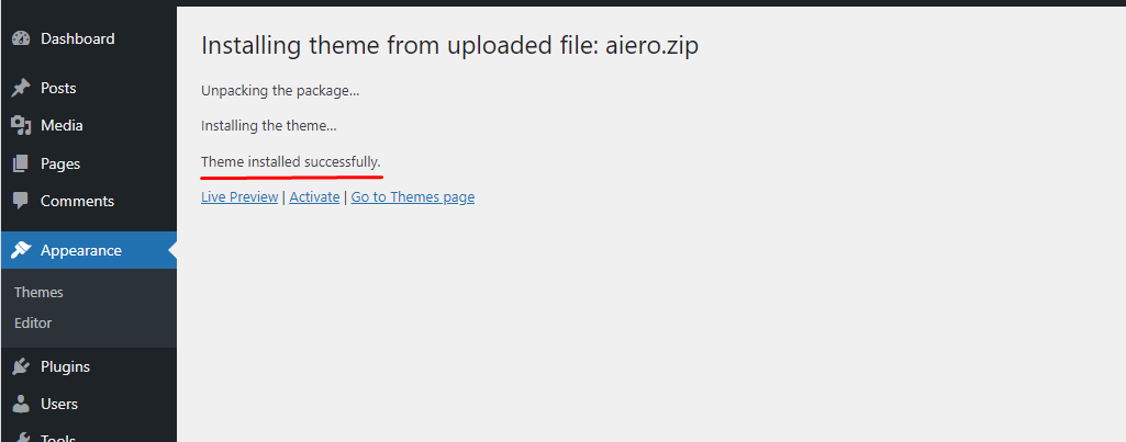
This is the easiest way. You need to go to Appearance > Themes
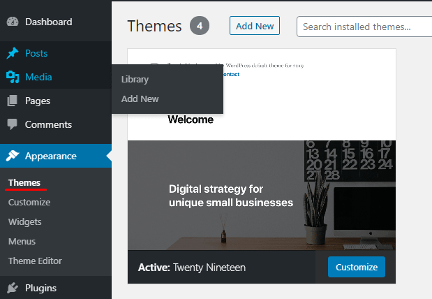
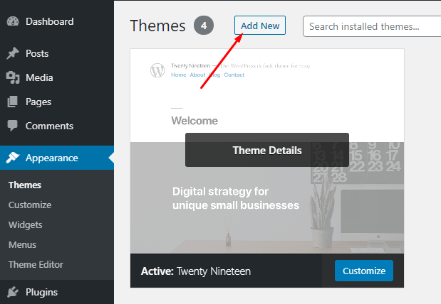
Click on the Add New button
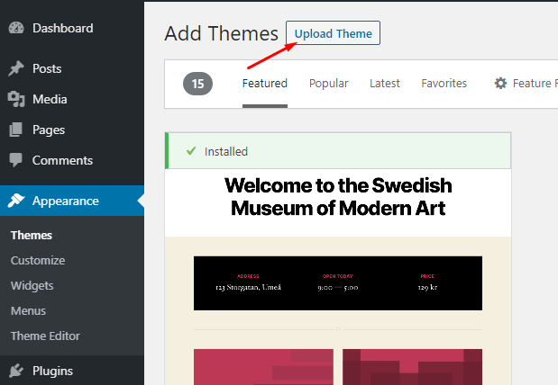
Click on the Upload Theme button
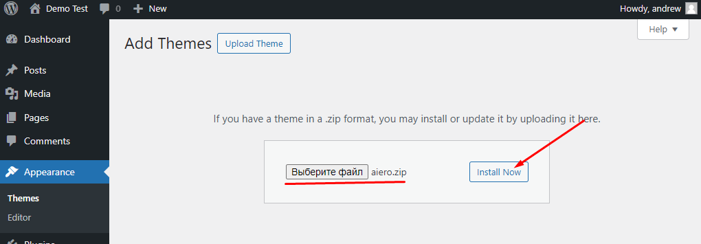
In the window that appears after this choose the aiero.zip archive from the location you unpacked it to and click the Install Now button.
-
Uploading via an FTP-client or through a file manager built into the hosting.
First of all you need to unpack the contents of the aiero.zip archive. Then by means of an FTP-client (like FileZilla or similar to it) or using the file manager of the hosting you should copy the extracted folder, called aiero, to the ../wp-content/themes/ folder which you can find in the WordPress root folder.
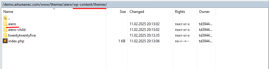
After doing this you can go to Appearance > Themes in the WordPress admin dashboard and pick Aiero theme from a list of available themes. Then
just click the Activate button.
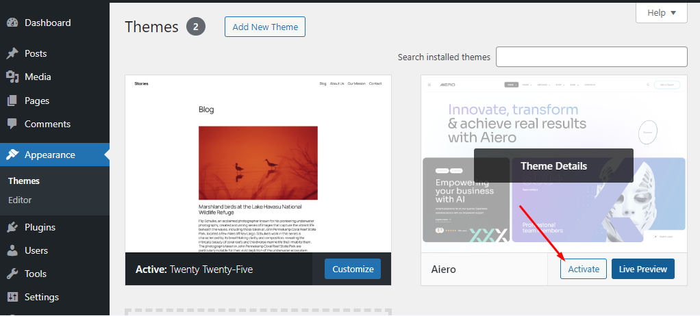
The theme is installed!
Next you can begin installing plugins. You will need them for the theme to work properly. After you finished installing the theme you should see a following message:

Click the Begin activating plugins link.
Chose all of the suggested plugins, then choose the Install option in Bulk Actions field and click Apply button.
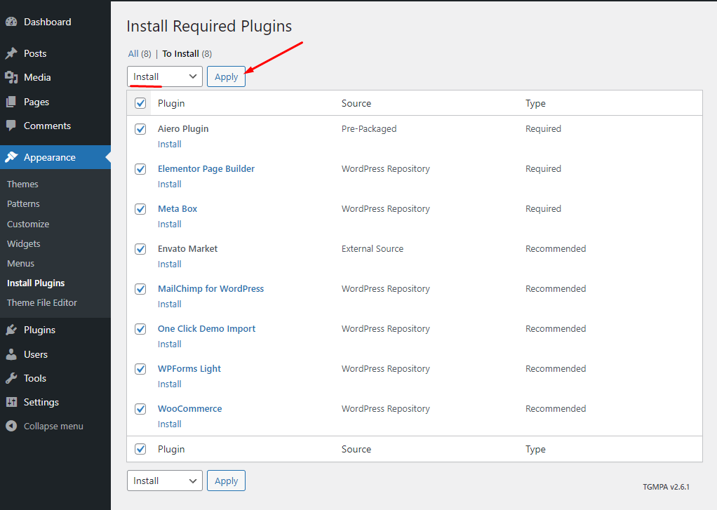
Wait for the plugins installation process to finish, this may take several minutes.

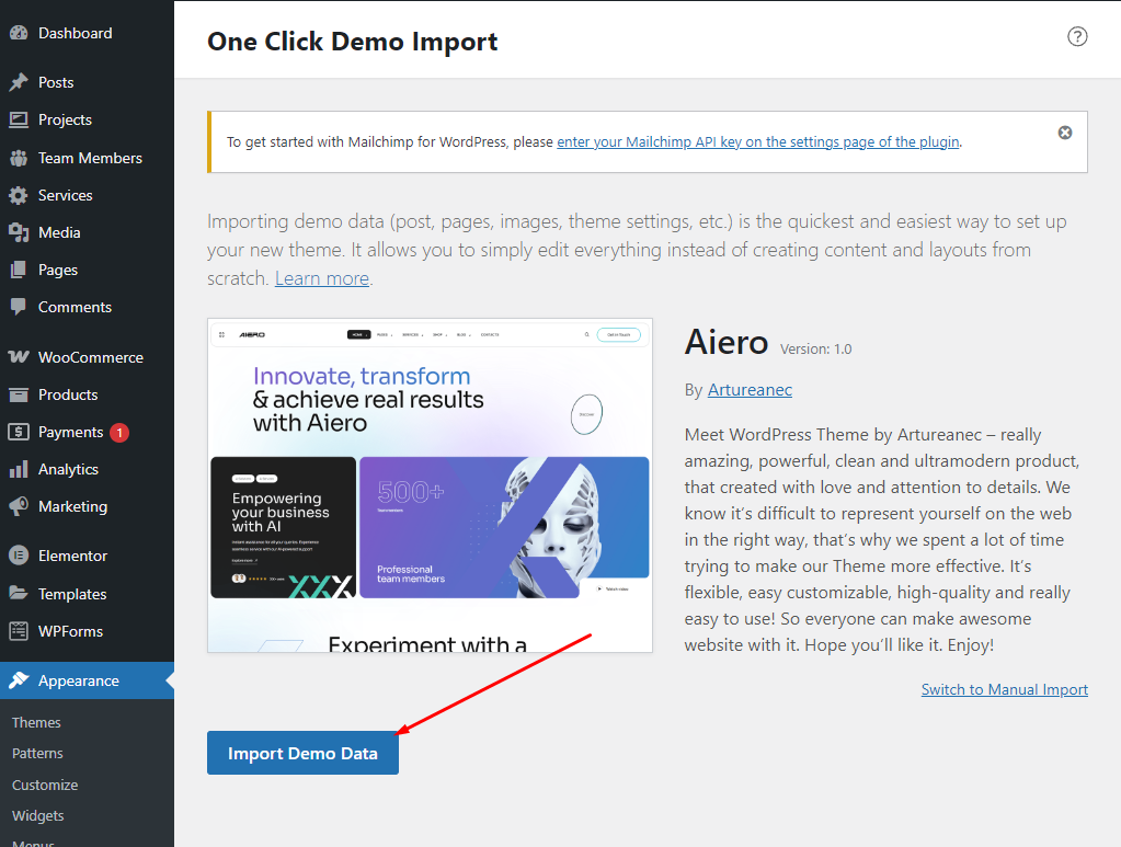
All that’s left to do is to load the demo-data. Bear in mind that during the demo-data installation all of your posts, pages and products are deleted and some of the settings of WordpRess and WooCommerce are changed. We recommend installing the demo-data on top of a clean WordPress setup to ensure that you will not lose any of your important data.
Then go to Appearance > Import Demo Data menu and click the Import Demo Data button.
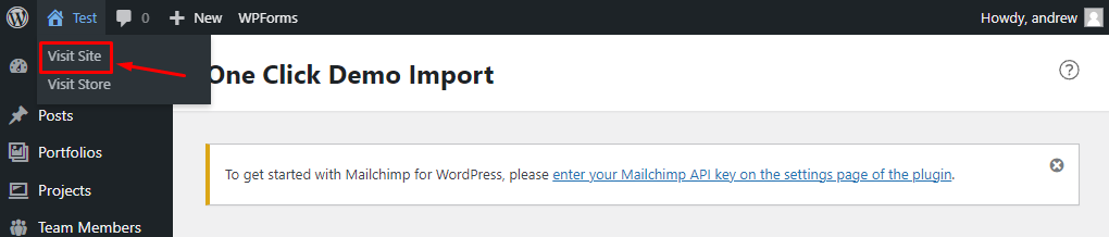
That’s it! In order to see the results you should move your mouse pointer towards your web-site name in the top left corner of the screen and click the Visit Site button in the menu that will appear.
04. Customization
Our theme has flexible settings. This chapter of the manual will explain each one of them.
All of the settings can be divided into the following categories:
- WordPress Settings — general settings common for all of the WordPress-based web-sites. To access these settings you should click the Settings button in the left navigation panel. You can further read about these settings in detail at the following URL: https://wordpress.org/support/article/administration-screens/#settings-configuration-settings
- Customizer Settings — general theme settings which are applied to all of the web-site pages. To access these settings click Appearance > Customize button.
- Metabox Settings — settings for each page or post. These settings are mostly the same as Customizer Settings, but they have a higher priority and affect only a page or a post you used them for. You can find Metabox Settings at the bottom of any post or page editing screen.
In our demo data, the header and footer of the home pages are individually configured to show the capabilities of the theme. Also, the background of the Page Title block is often individually set. All of this is done via Metabox settings. To make the page obey the general settings again, you need to leave the fields empty in the metaboxes and select the 'Default' value in the drop-down lists.
1. How to change Header Logo for all pages and each page individually
You can change Header Logo for all pages using Customizer settings. You can do this in Appearance > Customize -> Header Settings > Logo. You can read more about it here: Header Settings
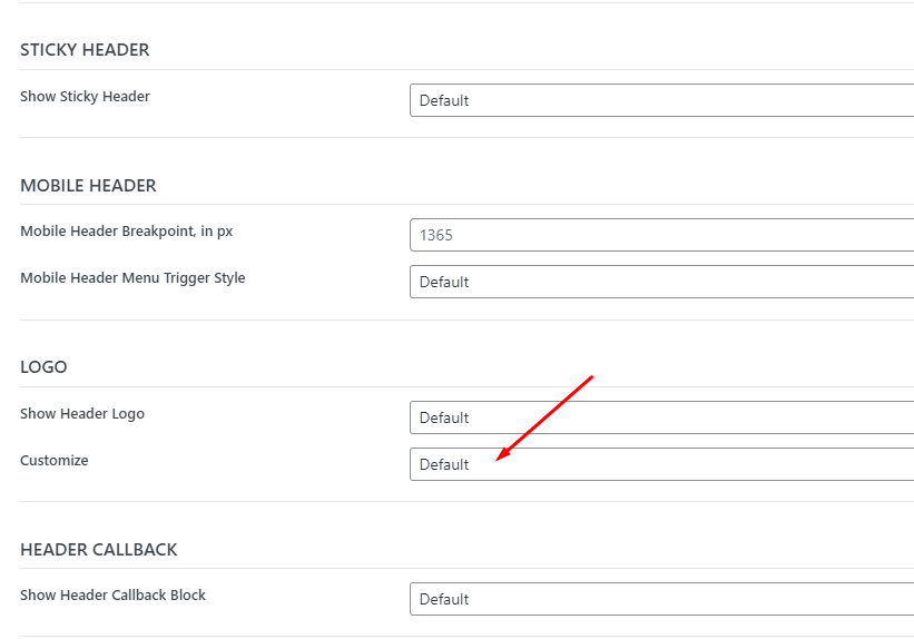
Some of our home pages on demo site have logos that are different from those set in Customizer. You can change it via Metabox Header settings in at the bottom of any post or page editing screen. If you need to use default logo from Customizer just set Customize to Default in Logo section of Header settings.
2. How to edit Header and Footer for all pages and each page individually
You can change Header and Footer colors as well as Typography, layout and their elements for all pages using Customizer settings. You can do this in Appearance > Customize -> Header Settings and Appearance > Customize -> Footer Settings. You can read more about it here: Header Settings and here: Footer Settings
Some of our home pages on demo site have different Header and Footer appearance, different visible elements and widgets from those set in Customizer. You can change them via Metabox Header and Footer settings in at the bottom of any post or page editing screen. If you need to use default settings from Customizer just leave settings fields empty or select the 'Default' value in the drop-down lists.
All Header elements like Logos, Icons, Buttons etc. are part of Header template and can be changed only via Customizer or Metabox settings. Only Header Menu can be changed in Appearance > Menus page or in Appearance > Customize -> Menus section. Footer elements like widgets on the other hand can be edited in Appearance > Widgets page or Appearance > Customize -> Widgets section.
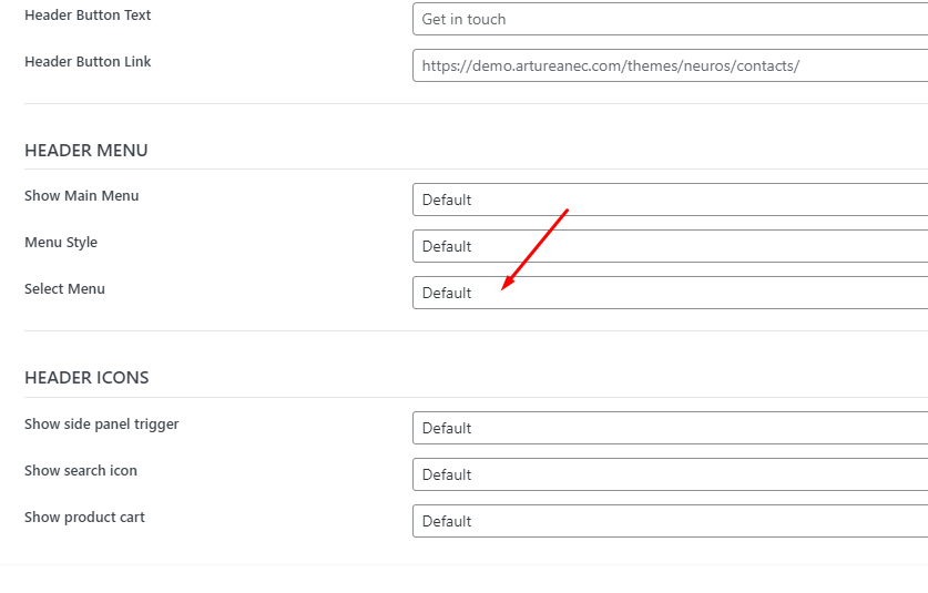
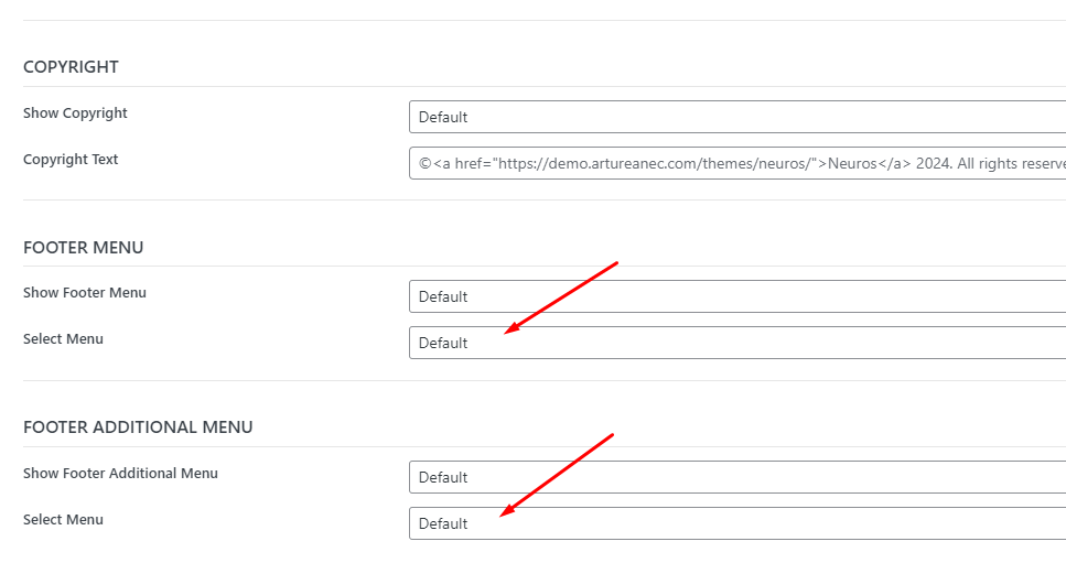
Each page or post can display it`s own Header and Footer menus different from those set in Customizer. You can change them in corresponding Select Menu setting in Header Menu or Footer Menu section of Metabox settings.
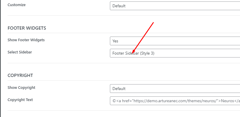
Footer widgets can be changed in Appearance > Widgets page or Appearance > Customize -> Widgets section. You can choose what Sidebar with widgets to display for all pages in Appearance > Customize -> Footer Settings > Footer Sidebar in Select Sidebar setting.
Additionally, you can change Sidebar for individual page or post in corresponding setting in Metabox settings.
3. How to edit Sidebar
Sidebar visibility and position can be changed in Appearance > Customize -> Sidebars. See more about it here: Sidebar Settings
Sidebar content can be edited in Appearance > Widgets page or Appearance > Customize -> Widgets section. Each post type has it`s own default sidebar: for pages it is Page Sidebar, for posts - Post Sidebar, for careers - Career Sidebar, for services - Service Sidebar, for case studies - Case Study Sidebar. There is also separate sidebar for archive pages - Archive Sidebar, for Woocommerce pages - Woocommerce Sidebar, for FAQ page - FAQ Sidebar, for Side Panel - Side Panel Sidebar, for Alternative Header Menu - Menu Sidebar and 5 Sidebars for Footer widgets on different home pages.
4. How to change custom post types slug
Custom post type slugs can be changed only in code. We recommend to activate Aiero child theme and add next PHP code to it`s functions.php file:
add_filter( 'register_post_type_args', 'aiero_change_post_types_slug_aiero_service', 10, 2 );
function aiero_change_post_types_slug_aiero_service( $args, $post_type ) {
    if ( 'aiero_service' === $post_type ) {
        $args['rewrite']['slug'] = 'Your Slug';
    }
    return $args;
}
This code works for Services post type. You`ll just need to replace 'Your Slug' with the slug you need. 'aiero_service' is specific name for Services post type. There 3 custom post types in total in our theme: Services, Projects and Team Members.
Each of this post types has it`s own name: Services - 'aiero_service', Projects - 'aiero_project', Team Members - 'aiero_team_member'.
If you need to change slug for one of these post types, replace in previous code 'aiero_service' part in function name and filter call with the name of post types mentioned earlier. You need to replace also 'aiero_service' string in the if statement with the same name. For example for Projects this code will look like this:
add_filter( 'register_post_type_args', 'aiero_change_post_types_slug_aiero_project', 10, 2 );
function aiero_change_post_types_slug_aiero_project( $args, $post_type ) {
    if ( 'aiero_project' === $post_type ) {
        $args['rewrite']['slug'] = 'Your Slug';
    }
    return $args;
}
After you made this changes, be sure to re-save your permalinks, otherwise the server will return a 404 error on single pages of these post types: Go to Settings > Permalinks and click Save changes.
5. How to edit Content Slider widget in Elementor editor
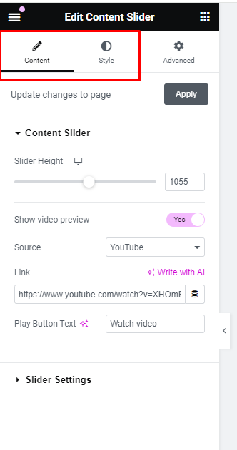
Content Slider settings consists of 2 main tabs: Content and Style.
Content section is used for adding slides to slider and styling the majority of slider`s content. Here you can set Slider`s height and customize Video preview button. In Slider Settings section you can add slides and switch visibility of Navigation buttons and dots as well as other slider specific settings as Autoplay or Animation speed.
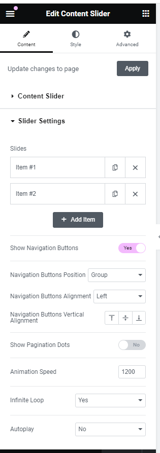
In Style tab you can customize Video preview button appearance in Video Preview Settings and appearance of Navigation buttons and dots in Slider Navigation Settings.
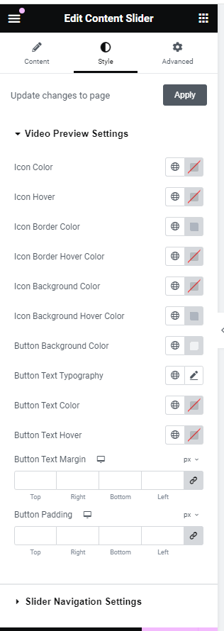
In Slider Settings you can edit each slide in Slides list. To edit certain slide click on it, then slide`s settings will show up.
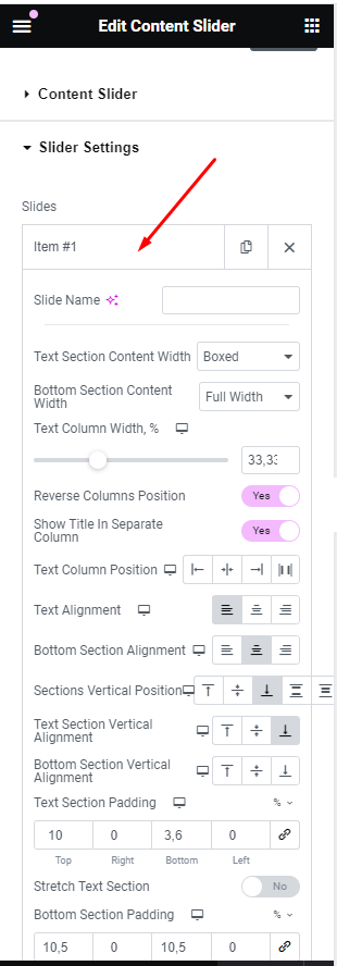
For each slide you can customize it`s layout, alignment, text and bottom sections indents. Main part of the slide is text section which can contain Heading, Text, Button, Video Popup Button and Counter elements. Each of these elements has it`s own tab in slide`s tabs where you can customize their content, colors, typography, indents, etc. You can also add Bottom section which can contain image.
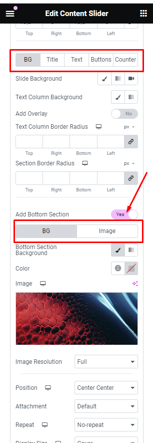
Each slide as well text column and bottom section can have own background which you can change in BG tab.
6. How to change icons for Elementor Services Listing widget
Services Listing widget is designed to work with posts of custom post type - services. This widget can display either SVG icons or font icons. This display mode can be changed in Icon Type setting of Services Listing section.
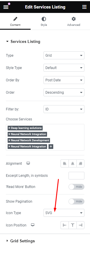
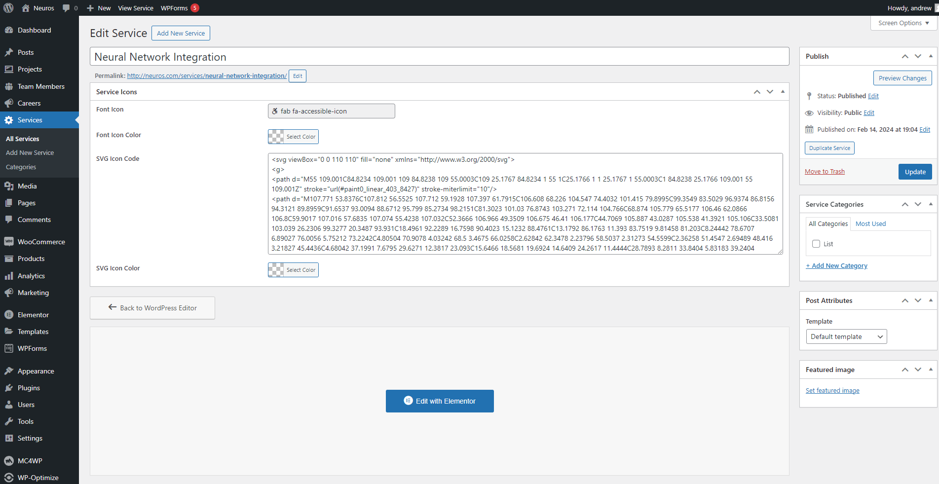
Icons for each service can be changed in Edit Service page in Services submenu of Dashboard menu.
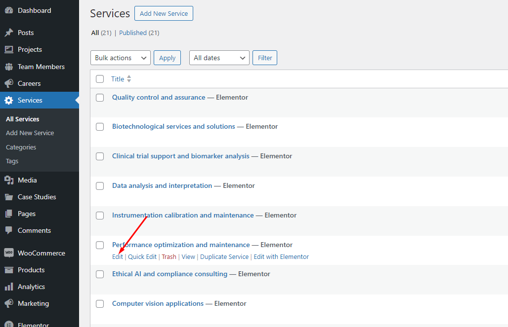
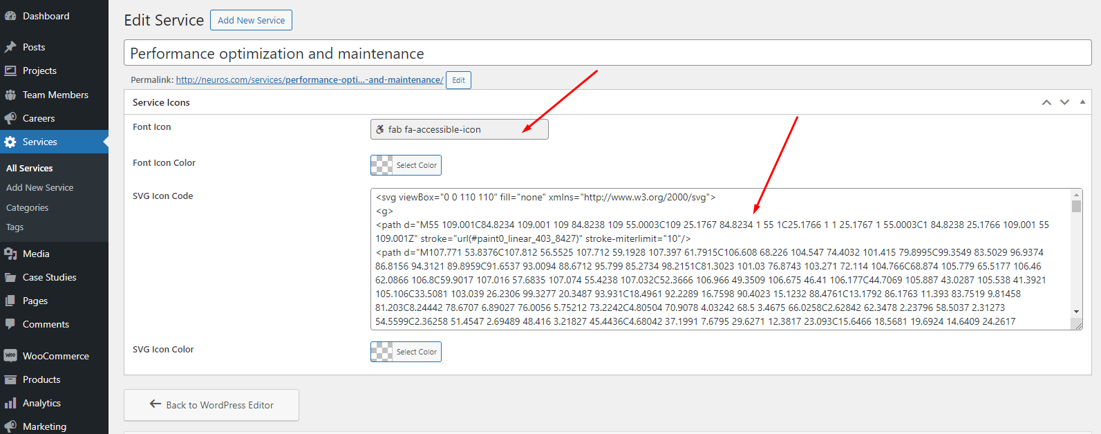
Here you can set both Font Icon and SVG Icon as well as colors for them. Font Icons can be selected from the icons preset via Iconpicker. SVG Icons can be edited via SVG code pasted in respective SVG Icon Code field.
7. How to change Page Title background image
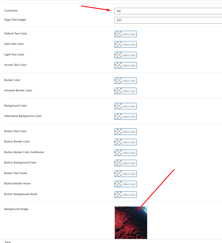
You can change Page Title background image for all pages using Customizer settings. You can do this in Appearance > Customize -> Page Title Settings > General in Background Image setting. You can read more about it here: Page Title Settings
Some of our pages on demo site have background images that are different from those set in Customizer. You can change it via Metabox Page Title settings in at the bottom of any post or page editing screen. If you need to use default background image from Customizer just set Customize to Default in General section of Page Title settings or leave this setting empty.
8. How to change Page Title heading
You can change Page Title heading for single page for every default and custom post type.
Customizer has setting called Single Page Title for posts - Single Post Page Title, projects - Project Single Page Title, team members - Team Member Single Page Title and services - Service Single Page Title. More about these settings you can read here: Single Post, Projects, Team Members, Services.
You can use custom string or ‘%s’ symbol in the text to show initial post title instead.
05. Update
There are several ways to update a theme.
The easiest way is to install the Envato Market plugin.
- Install the plugin and go to its settings (Dashboard menu: Envato Market > 'Settings' tab).
- Follow the steps in the short instructions.
- Now you have a list of purchased products. If an update for one of the products is available, you will receive a notification and will be able to update the product in one click.
The second way is to simply download the new version of the theme from the Envato website and install it as a new theme. WordPress will automatically detect that such a theme is already installed and offer to update the files.
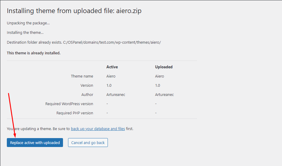
The third way to update a theme is to delete the folder with the theme on the server. Then download the new version of the theme from the Envato website and upload it to the server instead of the old theme using an FTP client (for example, FileZilla).
If after updating the theme a message appears about the need to update the theme plugin, do it immediately. For security reasons, many theme functions are moved to a separate plugin and without updating it the theme will not be able to work fully.
Also, after updating the theme, do not forget to clear the server cache and CDN, if you use them.
06. Customizer Settings
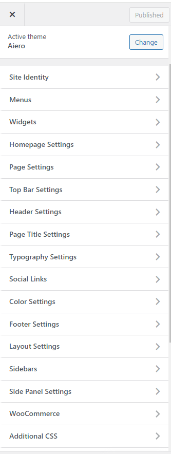
In order to open Customizer Settings you should go to Appearance > Customize
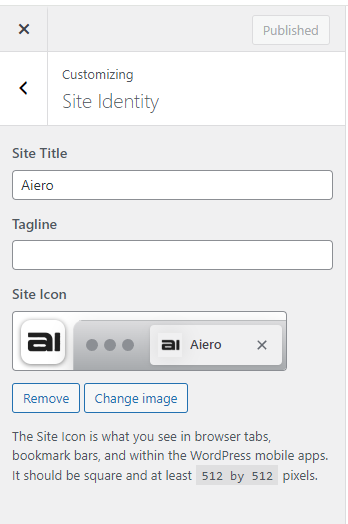
Site Identity
You can set the Site Title, Tagline and Site Icon inside this section.
Site Title — is your web-site name. It appears in browser tabs as well as in place of the site icon if you did not set a picture for it.
Tagline — is a short slogan which helps users understand what your web-site is about. It is displayed inside a browser tab. Our theme design does not make use of a tagline.
Site Icon — is a great way to distinguish your web-site among other browser tabs. This is usually one of the variations of your website logo.
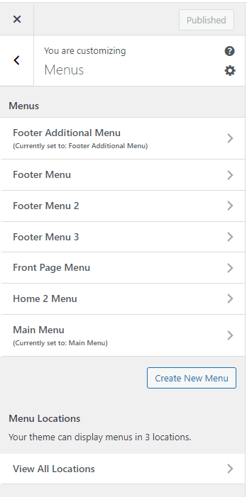
Menus
Menus section has the same functions you can find in Appearance > Menus. You can create, edit, delete a menu here as well as choose its position on your web-site screen.
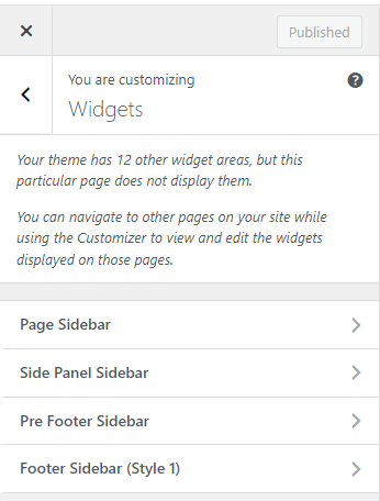
Widgets
Widgets section has almost the same functions as the ones you can find in Appearance > Widgets. Here you can add, customize and delete widgets inside the sections displayed at a current page. You can navigate to the other pages on your web-site while using the Customizer to view and edit the widgets displayed on those pages.
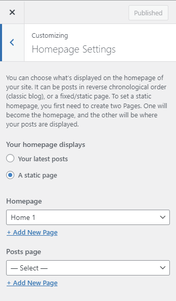
Homepage Settings
Homepage Settings has partially the same functions as the ones you can find in Settings > Reading. You can choose what is displayed on your web-site homepage. It can be posts in reverse chronological order (classig blog), of a fixed/static page. In order to set a static homepage, you first need to create two Pages. One of them will be the homepage and the other one will contain all of your posts and display them.
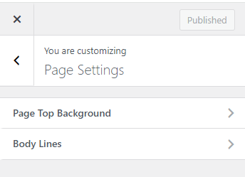
Page Settings
This section allows you to customize page`s top background image.
Page Top Background
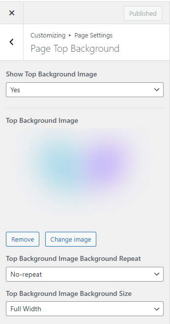
Show Top Background Image — this allows you to show or hide page`s background image that appears on the top of the page
Top Background Image — this allows you to set page`s top background image
Top Background Image Background Repeat, Top Background Image Background Size — these are the settings for the page`s top background image.
Top Bar Settings
This section allows you to set up the data displayed at the upper part of the header — in a thin line of contrast colors called Top Bar.
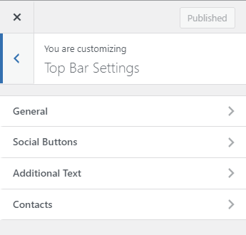
General
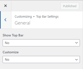
Show Top Bar — this allows you to show or hide the Top Bar
Customize — if you set this to “Yes” you can see all of the settings for the SideBar color scheme. You can read about color schemes in detail at the “Color Settings” section.
Social Buttons
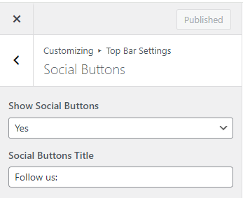
Show Social Buttons — this allows you to show or hide the social networks buttons.
Social Buttons Title — this allows you to set social networks buttons title.
Additional Text
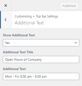
Show Additional Text — this allows you to show or hide the Additional Text.
Additional Text — this allows you to input the text to be shown.
Contacts
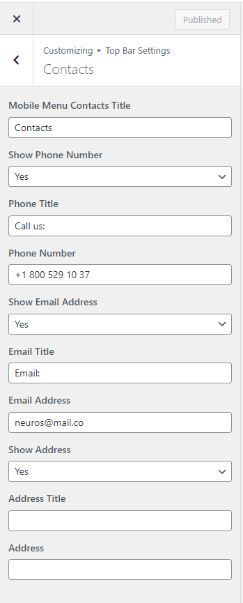
In this section you can set up the contact details displayed in the Top Bar.
Mobile Menu Contacts Title — this allows you to set mobile menu`s contacts title.
Show Phone Number — this allows you to show or hide a phone number.
Phone Title — this allows you to set the phone number`s title to be displayed.
Phone Number — this allows you to set the phone number to be displayed.
Show Email Address — this allows you to show or hide an e-mail address.
Email Title — this allows you to set the email address`s title to be displayed.
Email Address — this allows you to set the email address to be displayed.
Show Address — this allows you to show or hide a business address.
Address Title — this allows you to set the address`s title to be displayed.
Address — this allows you to set the business address to be displayed.
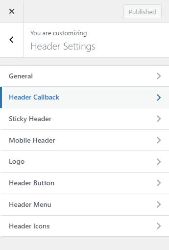
Header Settings
This section will help you customize the upper part of the website (Header) appearance.
General
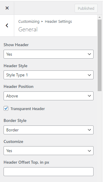
Show Header — this allows you to show or hide the Header, this setting works site-wide.
Header Style — here you can select one of the previously installed header styles.
Header Position — here you can select header’s position in relation to the content of the page: inline or on top of the contents (for example on top of an image or slider).
Transparent Header — here you can toggle transparency of the header background.
Border Style — here you can toggle header border visibility.
Customize — if you set this to “Yes” you can see all of the settings for the Header color scheme. You can read about color schemes in detail at the “Color Settings” section.
Header Offset Top, in px — here you can set header`s offset from the top of the page.
Header Callback
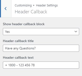
This section allows you to set up displaying a phone number and its short annotation for header style of type 2.
Show header callback block — show or hide the phone number block.
Header callback title — phone number annotation.
Header callback text — this field is used to input the phone number for communication.
Sticky Header
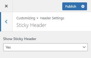
Show Sticky Header — this allows you to show or hide the “sticky” header.
Mobile Header
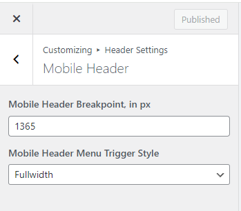
This section contains mobile menu settings.
Mobile Header Breakpoint, in px — this allows you to set a screen width that determines when the mobile menu would switch to the desktop menu.
Mobile Header Menu Trigger Style — this allows you to set submenu trigger`s display style in mobile menu - fullwidth or inline.
Logo
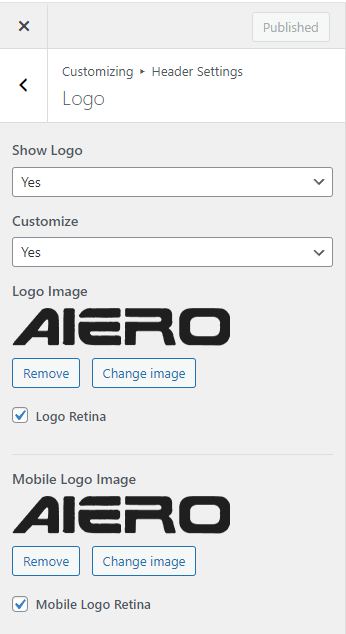
Show Logo — this allows you to show or hide your logo in the Header (yes, sometimes people want it to be hidden).
Customize — this allows you to setup the logo or leave the default settings (site title as a text).
Logo Image — here you can choose an image for your web-site logo. If you activate the Logo Retina checkbox the logo image will be downscaled by half in order to look better on screens with high pixel density. If you delete the image, then the title of your web-site will be shown instead.
Header Button
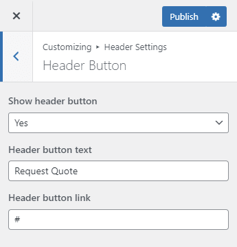
Show Header Button — here you can enable/disable an additional button display in the web-site header. For example you can have a ‘Buy now’ or ‘Make a donation’ or ‘Show items on sale now!’ button or the like. If the button is enabled you can choose its text (Header Button Text) and URL address (Header Button Link).
Header Menu
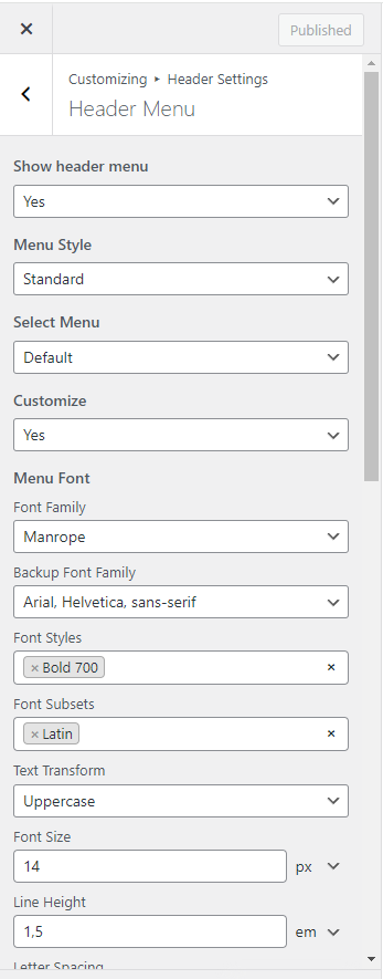
Here you can find all of the web-site main menu display settings.
Show Header Menu — this allows you to show or hide the web-site main menu.
Menu Style — this allows you choose between 2 menu styles: standard and compact with popup modal menu.
Select Menu — this allows you to replace the main menu with any of the menus created in WordPress.
Customize — this gives you access to main menu fonts settings:
Menu Font — this allows you to set the main menu font (Font Family, Text Transform, Font Size, Font Weight, Line Height, etc.)
Sub Menu Font — this allows you to set the sub-menu font (Font Family, Text Transform, Font Size, Font Weight, Line Height, etc.)
Header Icons
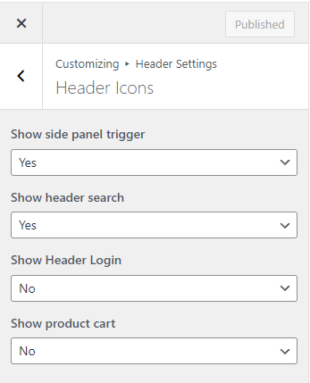
Show side panel trigger — this allows you to show or hide an additional drop-down panel with widgets.
Show header search — this allows you to show or hide site-wide search button.
Show header login — this allows you to show or hide login/logout buttons.
Show product cart — this allows you to show or hide the product cart button. This option is only available if you have Woocommerce plug-in installed.
Page Title Settings
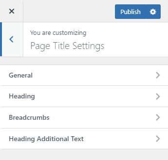
General
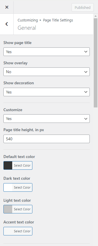
Show Page Title — this allows you to show or hide page title block.
Show Overlay — this allows you to turn the overlay on or off and set its color and transparency.
Show decoration — this allows you to show or hide page title`s decoration blocks.
Customize — this gives you access to Page Title advanced settings.
Page title height, in px — this allows you to set page title height value for desktop environment.
Following this section are settings for the Page Title block color scheme. You can read about color schemes in detail at the Color Settings section.
Image, Background Position, Background Repeat, Background Size — background image settings.
Hide Background Image on Mobile Devices — this allows you to hide the background image on devices with screen width of less than 768px, showing only background color.
Hide Background Image on Tablet Devices — this allows you to hide the background image for devices with screen width from 768 up to 992px, only background colour will be displayed.
Heading
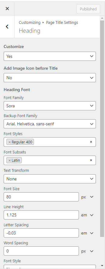
Customize — this gives you access to page heading font settings.
Add Image Icon before Title — this allows you to show ore hide page title image icon.
Icon Image — this allows you set image before title.
Icon Image Retina — checkbox the image will be downscaled by half in order to look better on screens with high pixel density.
Heading Font — this allows you to set the page heading font (Font Family, Text Transform, Font Size, Font Weight, Line Height, etc.)
Breadcrumbs
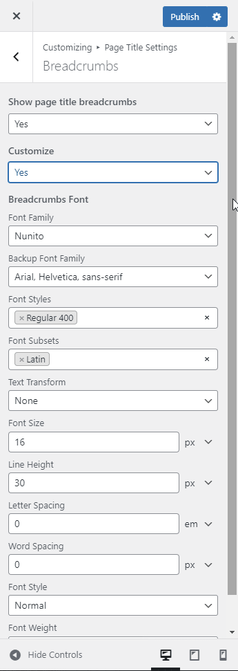
Show page title breadcrumbs — this allows you to show or hide page title breadcrumbs.
Customize — this allows you to customize the breadcrumbs.
Breadcrumbs Font — this allows you to set the breadcrumbs font (Font Family, Text Transform, Font Size, Font Weight, Line Height, etc.)
Heading Additional Text
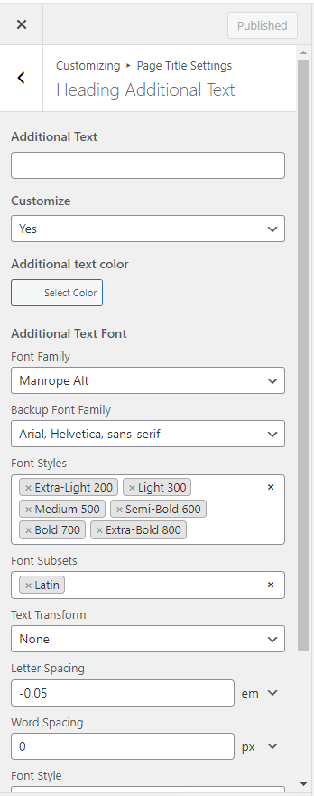
This section contains Page Title block additional text settings.
Additional Text — this allows you to set the text to be displayed.
Customize - allows access to color settings.
Additional Text Color — this allows you to set the additional text font color independently from the chosen color scheme.
Additional Text Font — this allows you to set the additional text font (Font Family, Text Transform, Font Size, Font Weight, Letter Spacing, etc.)
Additional Text Offset Bottom, in % — this allows you to set the additional text offset from the bottom of the page title in percentage.
Typography Settings
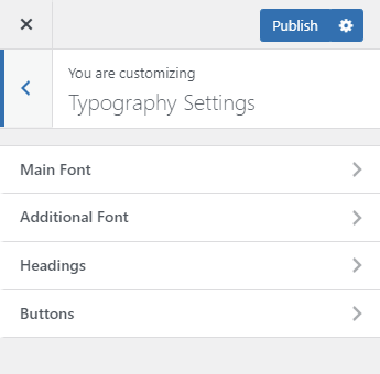 This section contains all of the typography settings for the web-site content main elements.
Main Font
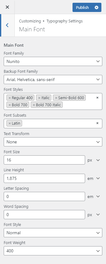
This section contains settings for the pages and posts main text.
Main Font — this allows you to set the web-page main font (Font Family, Text Transform, Font Size, Font Weight, Line Height, etc.)
Additional Font
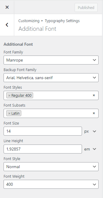
This section contains settings for an additional fond used for contrast with the main font in some of the elements like form inputs.
Additional Font — this allows you to set up the additional font (Font Family, Text Transform, Font Size, Font Weight, Line Height, etc.)
Headings
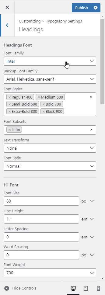
This section contains the default settings for text headings.
Headings Font — this section contains main settings for all of the headings (Font Family, Text Transform, Font Style, etc.).
H1 Font - H6 Font — this section contains individual settings for each of the heading levels (Font Size, Line Height, Letter Spacing, Font Weight, etc.)
Buttons
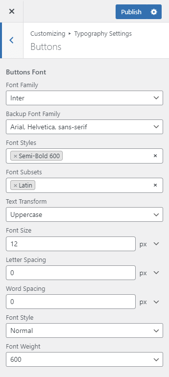
This section contains the default settings for web-site buttons.
Buttons Font — this allows you to set buttons’ font (Font Family, Text Transform, Font Size, Font Weight, Line Height, etc.)
Social Links
This section contains settings for the social networks buttons all across the web-site — footer, header, etc.
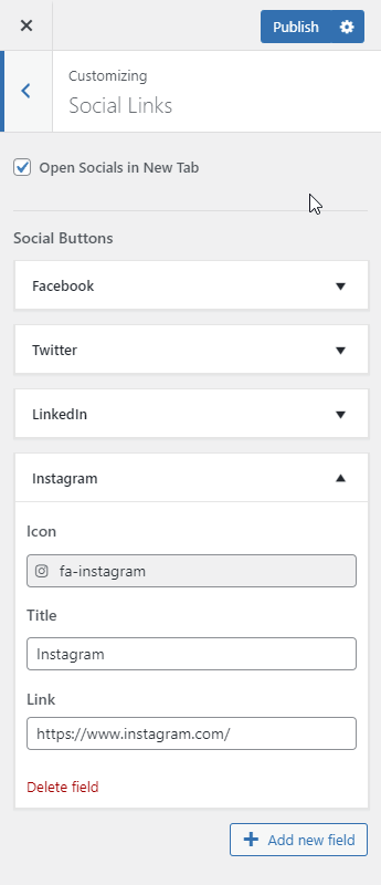
Open Socials in New Tab — if this is selected, the resulting page after clicking the social network icon will be opened in a separate browser tab.
Social Buttons — this allows you to show or hide social networks buttons:
- Icon — this field allows you to set the button icon (Font Awesome Brands library)
- Title — this field allows you to input the social network title
- Link — this field allows you to input the social network account url
Color Settings
This section allows you to customize colors of all of the web-site elements, not including Elementor widgets which can be customize separately.
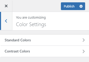
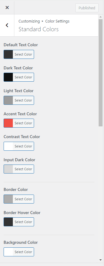
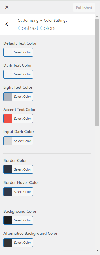
The color system has been reworked completely. Now you can change the color scheme for the whole web-site or a single page with just a couple of mouse clicks!
The colors are separated into 2 categories:
Standard Colors determines colors for almost all of the web-site blocks (usually it’s light background and dark text, for example of the header main text);
Contrast Colors determines contrast areas colors (usually dark background and light text, for example in Top Bar and Footer).
Each category contains 10 color settings (Standard Colors contains additional Contrast Text Color) which set all of the colors used on the web-site.
Default Text Color — this allows you to set the main text color for the whole web-site (except contrast areas).
Dark Text Color — this allows you to set a darker text color in relation to the main one, it is often used to highlight a portion of text, headers as usual.
Light Text Color — this allows you to set a brighter text color in relation to the main one, it is commonly used to highlight additional information, for example posts meta data.
Accent Text Color — this allows you to set the main contrast color, which determines style for the whole page. Usually by changing only this color setting you can change the whole web-site feeling. It is used for links, icons, contrast blocks backgrounds etc.
Input Dark Color — this allows you to set the form inputs background color. It is used for checkboxes and radio buttons.
Border Color — this allows you to set a color for borders and dividers. For example fields’ borders of forms and dividers between separate blocks.
Border Hover Color — it is usually darker than Border Color. It is used for example as a color for active fields’ borders.
Background Color — this allows you to set the main background color for all pages, it is usually bright.
Alternative Background Color — this allows you to set an alternative background color used when you need to highlight one of the blocks, but not as strongly as contrast blocks (for example quote blocks or Call-to-Action blocks).
Button Text Color, Button Border Color, Button Border Color Additional, Button Background Color, Button Background Color Additional, Button Text Hover, Button Border Hover, Button Border Hover Additional, Button Background Hover, Button Background Hover Additional — this allows you to set colors for buttons used on the web-site. Additional Button Border and Background colors are mainly used for buttons border and background gradients. By popular demand we made it possible to set the colors for buttons independently from the chosen color scheme.
Contrast Text Color — this allows you to set an contrast color for elements with dark backdround like some links or buttons. It is available only for Standard Colors.
Button Border Style — this allows you to set solid or gradient border style for buttons and pagination links.
Button Background Style — this allows you to set solid or gradient background style for buttons and pagination links.
Footer Settings
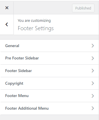 This section will help you customize the lower part of the web-site (Footer) display.
General
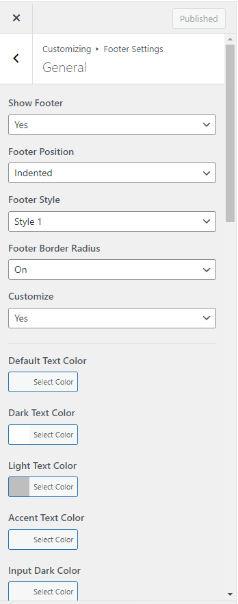
Show Footer — this setting allows you to select whether you want to have the lower part displayed or not.
Footer Position — this setting allows you to select the footer indentation style.
Footer Style — this setting allows you to select the footer appearance from a list.
Footer Border Radius — this setting allows you to change footer border radius style.
Customize — this gives you access to advanced settings. Color settings allow you to change or edit the footer color scheme.
Bottom Image — this setting allows you to select a background image for the footer.
Footer Background Position, Footer Background Repeat, Footer Background Size — these are the settings for the footer background image.
Pre Footer Sidebar
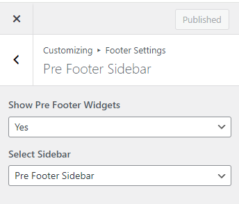
This section contains settings for pre footer widgets display.
Show Pre Footer Widgets — this allows you to show or hide widget area in the pre footer.
Select Sidebar — this allows you to select what widgets you want to be displayed in pre footer area. You can view and customize the sidebars by going to Appearance > Widgets.
Footer Sidebar
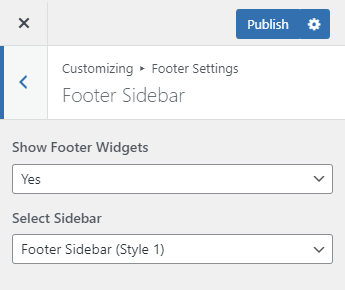
This section contains settings for footer widgets display.
Show Footer Widgets — this allows you to show or hide widget area in the footer.
Select Sidebar — this allows you to select what widgets you want to be displayed. You can view and customize the sidebars by going to Appearance > Widgets.
Copyright
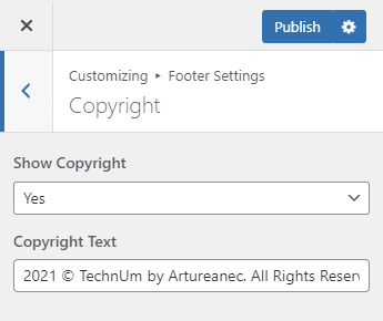
Show Copyright — this allows you to show or hide copyright line.
Copyright Text — this is a line of text aimed at informing the web-site users about copyright holders of all of the web-site media content.
Footer Menu
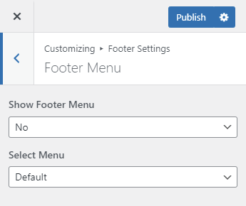
Show Footer Menu — this allows you to show or hide the footer menu.
Select Menu — this allows you to choose a menu to be displayed in footer from a list of the previously created ones in WordPress.
Footer Additional Menu
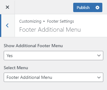
Show Additional Footer Menu — this allows you to show or hide a small additional menu in the footer.
Select Menu — this allows you to choose an additional menu to be displayed in footer from a list of the previously created menus in WordPress.
Layout Settings
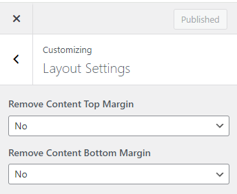 This section will help you to add or remove top and bottom margins for the pages and posts content area.
Remove Content Top Margin — this setting allows you to remove or add top margin for content area.
Remove Content Bottom Margin — this setting allows you to remove or add bottom margin for content area.
Sidebars
This section allows you to determine whether the main widget sidebar will be displayed or not, as well as select the side you want to have the widget sidebar displayed at for each of the page types.
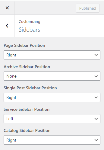
Page Sidebar Position — this setting allows you to set the sidebar position on standard pages.
Archive Sidebar Position — this allows you to set the sidebar position on archive pages.
Single Post Sidebar Position — this allows you to set the sidebar position on single post pages.
Service Sidebar Position — this allows you to set the sidebar position on single service pages.
Catalog Sidebar Position — this allows you to set the sidebar position on shop catalog page.
Side Panel Settings
This section allows you to set side panel logo image, it`s decoration background image and define whether to show social buttons in Side Panel.
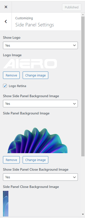
Show Logo — this allows you to show or hide your logo in Side Panel.
Logo Image — here you can choose an image for your Side Panel logo. If you activate the Logo Retina checkbox the logo image will be downscaled by half in order to look better on screens with high pixel density.
Show Side Panel Background Image — this allows you to show or hide your Side Panel decoration background image.
Side Panel Background Image — here you can choose an image for your Side Panel decoration.
Show Side Panel Close Background Image — this allows you to show or hide your Side Panel close button background image.
Side Panel Close Background Image — here you can choose an image for your Side Panel close button.
Show Social Buttons — this allows you to show or hide the social networks buttons in Side Panel.
WooCommerce
This section contains settings for the store, it is available only if you have the WooCommerce plugin installed.
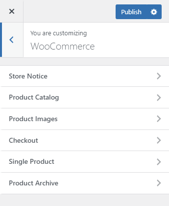
Store Notice
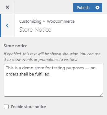
Store Notice — If enabled, this text will be shown site-wide. You can use it to show events or promotions to the visitors!
Product Catalog
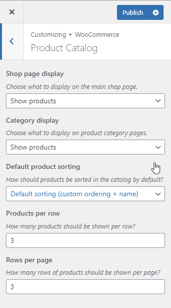
Shop page display — Choose what to display on the main shop page.
Category display — Choose what to display on product category pages.
Default product sorting — Choose how the products should be sorted in the catalog by default.
Products per row — Choose how many products should be shown per row.
Rows per page — Choose how many rows of products should be shown per page.
Product Images
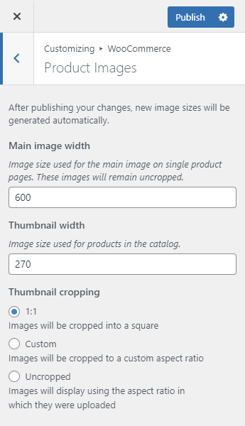
Main image width — Image size used for the main image on single product pages. These images will remain uncropped.
Thumbnail width — Image size used for products in the catalog.
Thumbnail cropping — this allows you to set up thumbnail cropping or disable it altogether.
Checkout
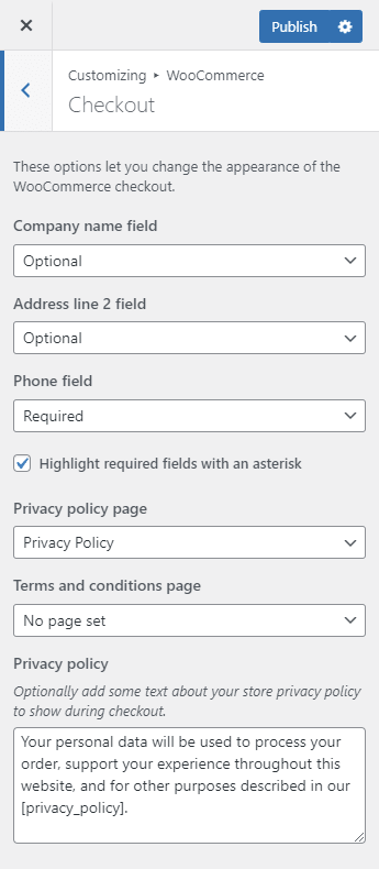
These options let you change the appearance of the WooCommerce checkout.
Company name field, Address line 2 field, Phone field — hide corresponding fields, make them required or optional.
Highlight required fields with an asterisk — if this is selected, then the required fields will be marked with a star sign (*).
Privacy policy page, Terms and conditions page — choose the corresponding pages from the list of existing web-site pages.
Privacy policy — optionally add some text about your store privacy policy to show during checkout. (This section appears only if the Privacy policy page is chosen)
Terms and conditions — optionally add some text for the terms checkbox that customers must accept. (This section appears only if the Terms and conditions page is chosen)
Single Product
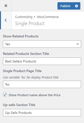
This contains some of the product pages settings.
Show Related Products - allows you to hide the Related Products area on the product page.
Related Products Section Title — this allows you to input text used as a title for the Related Products section if it is set-up.
Single Product Page Title — this allows you to input text used for the product page title. You can use the ‘%s’ symbol in the text, which will be automatically substituted with the product name.
Show Product name above the Price — By default the product name is displayed in the page title. You can customize the page in such a way that the page title would display a different name, for example a Single Product name. If you do so, in order to have a product name on the page you can select the Show Product Name Above the Price checkbox. The product name then would be displayed to the left of the product image above the product price.
Up-sells Section Title — this allows you to input text used as a title for the Up-sells section if it is set-up.
Product Archive
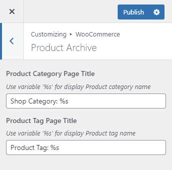
This contains some of the settings for archive products pages.
Product Category Page Title — this allows you to set a title for the product category archive pages. You can use the ‘%s’ symbol in the text, which will be automatically substituted with the category title.
Product Tag Page Title — this allows you to set a title for the product tag archive pages. You can use the ‘%s’ symbol in the text, which will be automatically substituted with the tag name.
Additional CSS
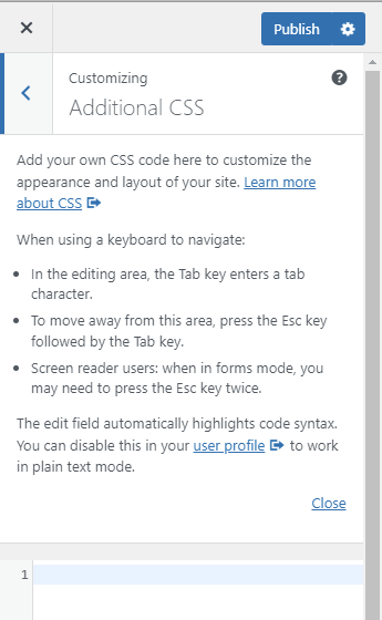 Add your own CSS code here to customize the appearance and layout of your site. Learn more about CSS
Single Post
This section contains the settings which allow you to display or hide different portions of the single posts.
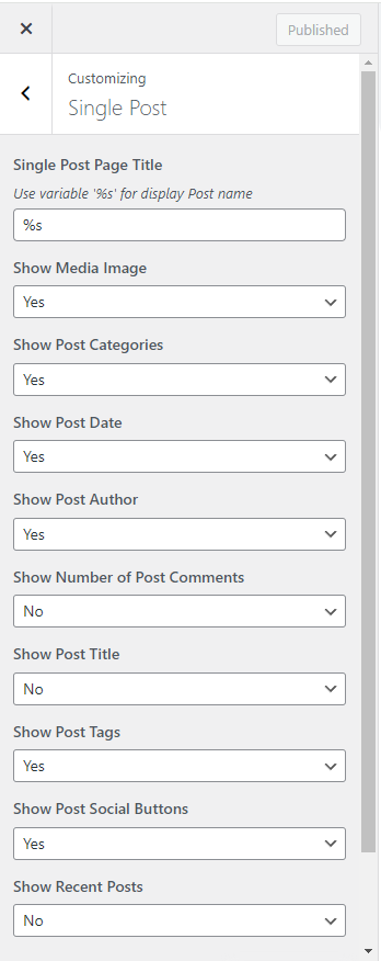
Single Post Page Title — this allows you to set a title for blog internal pages. You can use the ‘%s’ symbol in the text, which will be automatically substituted with the post title.
Show Media Image, Show Post Categories, Show Post Date, Show Post Author, Show Number of Post Comments, Show Post Title, Show Post Tags, Show Post Social Buttons — these settings allow you to choose which data would be displayed at the post page correspondingly.
Show Recent Posts — this allows you to display or hide recent posts.
Customize — this gives you access to recommended posts settings:
Recent Posts Section Title — this allows you to set a title for the recommended posts section.
Number of Posts — this allows you to set number of displayed recent posts.
Order By — this allows you to select recent posts sorting: randomly, by date or by user name.
Sort Order — this allows you to set recent posts sort order: in ascending or descending order.
Recent Posts Featured Image — this allows you to show or hide the Featured Image section in recent posts.
Recent Posts Categories — this allows you to show or hide categories in recent posts.
Recent Posts Title — this allows you to show or hide a title in recent posts.
Recent Posts Date — this allows you to show or hide date of publication in recent posts.
Recent Posts Author — this allows you to show or hide author name in recent posts.
Recent Posts Excerpt — this allows you to show or hide excerpts in recent posts.
Recent Posts Excerpt Length — this allows you to set the length of an excerpt measured in symbols.
Recent Posts Tags — this allows you to show or hide tags in recent posts.
Recent Posts 'Read More' Button — this allows you to show or hide ‘Read More’ button in recent posts.
Projects
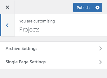
This section contains galleries settings for custom Projects type posts.
Archive Settings
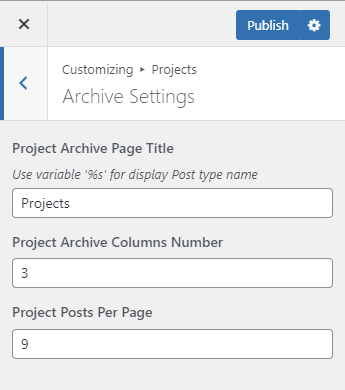
Project Archive Page Title — this allows you to set a title for the Projects archive pages. You can use the ‘%s’ symbol in the text, which will be automatically substituted with the archive name.
Project Archive Columns Number — this allows you to set a number of columns at the standard Projects archive page (available at your-site-url/projects/ address)
Project Posts Per Page — this allows you to set a number of posts to be displayed at the standard Projects archive page. Posts outside of this number would be displayed at the next page, thus enabling pagination.
Single Page Settings
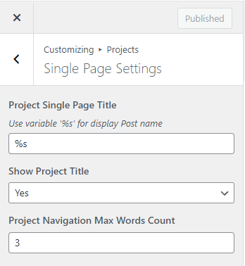
Project Single Page Title — this allows you to set a title for the separate project pages. You can use the ‘%s’ symbol in the text, which will be automatically substituted with the post title.
Show Project Title — this allows you to show or hide Project name on Project single page.
Project Navigation Max Words Count — this allows you to set the length of project`s name in words in single project navigation area.
Team Members
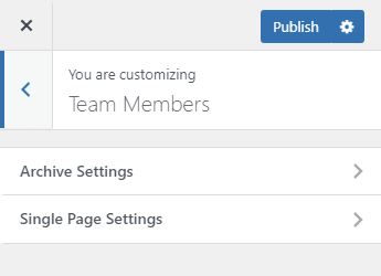
This section contains settings for custom Team Member type posts.
Archive Settings
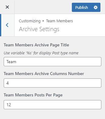
Team Members Archive Page Title — this allows you to set a title for the team members archive pages. You can use the ‘%s’ symbol in the text, which will be automatically substituted with the archive name.
Team Members Archive Columns Number — this allows you to set a number of columns at the standard Team Members archive page (available at your-site-url/team/ address).
Team Members Posts Per Page — this allows you to set a number of posts to be displayed at the standard Team Members archive page. Posts outside of this number would be displayed at the next page, thus enabling pagination.
Single Page Settings
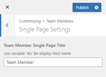
Team Members Single Page Title — this allows you to set a title for the separate team member pages. You can use the ‘%s’ symbol in the text, which will be automatically substituted with the post title.
Services
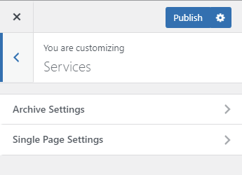
This section contains settings for custom Services type posts.
Archive Settings
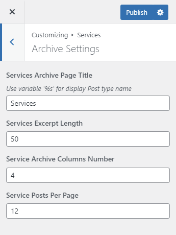
Services Archive Page Title — this allows you to set a title for the services archive pages. You can use the ‘%s’ symbol in the text, which will be automatically substituted with the archive name.
Services Excerpt Length — this allows you to set a number of symbols to be displayed in the post description at the standard Services archive page (available at your-site-url/services/ address).
Service Archive Columns Number — this allows you to set a number of columns at the standard Services archive page (available at your-site-url/services/ address).
Service Posts Per Page — this allows you to set a number of posts to be displayed at the standard Services archive page. Posts outside of this number would be displayed at the next page, thus enabling pagination.
Single Page Settings
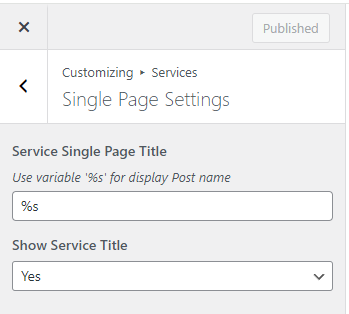
Service Single Page Title — this allows you to set a title for the separate service pages. You can use the ‘%s’ symbol in the text, which will be automatically substituted with the post title.
Show Service Title — this allows you to show or hide Service name on Service single page.
Error 404 Page
These settings will help you to customize the 404 error page (displayed if a requested page is not found).
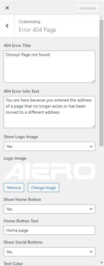
404 Error Title — this allows you to set a title for 404 error page, it will be displayed in large font.
404 Error Info Text — this allows you to input a short text to be displayed under the title.
Show Logo Image — this allows you to choose whether you want the logo to be displayed at the top of the page.
Logo Image — here you can choose an image for your 404 page.
Show Home Button — this allows you to show or hide a button linked to the home page.
Home Button Text — this allows you to input a text for the button linked to the home page.
Show Social Buttons — this allows you to show or hide the social networks buttons on 404 page.
Text Color — this allows you to customize text color on 404 page.
Text Hover Color — this allows you to customize social buttons hover color on 404 page.
Customize Background — this gives you access to page background setting: Background Color, Background Image, Background Position, Background Repeat, Background Size.
Additional Settings
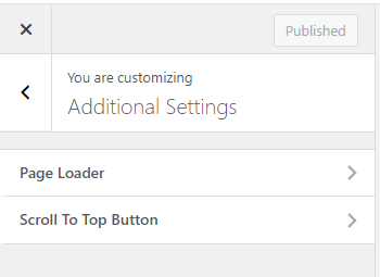
Page Loader
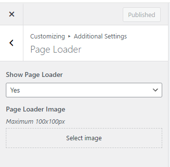
Show Page Loader – this allows you to show or hide a preloader on the web-site.
Page Loader Image – this allows you to set an image used for the preloader. Best result may be achieved if you choose a square image with dimensions of no more than 100x100px.
Scroll To Top Button
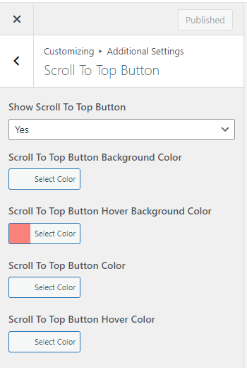
Show Scroll To Top Button — this allows you to show or hide scroll to top button, clicking on which allows you to scroll up to the beginning of the page.
Scroll To Top Button Background Color — this allows you to set Scroll To Top Button background color.
Scroll To Top Button Hover Background Color — this allows you to set Scroll To Top Button background color on hover.
Scroll To Top Button Color — this allows you to set Scroll To Top Button text color.
Scroll To Top Button Hover Color — this allows you to set Scroll To Top Button text color on hover.
07. Metabox Settings
There will be settings at the lower part of an editing page or post. These settings will only be applied to this page or post. The settings may differ according to the corresponding page or post type.
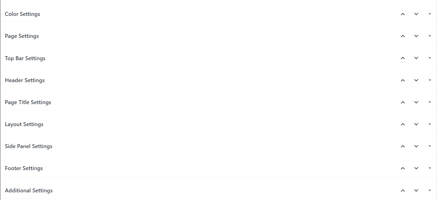
The settings are grouped for convenience:
- Color Settings
- Page Settings
- Top Bar Settings
- Header Settings
- Page Title Settings
- Layout Settings
- Side Panel Settings
- Footer Settings
- Additional Settings
All of the settings names correspond to the such of the Customizer settings, so you can read their description above in the Customizer Settings section.
In the Layout Settings section you can enable or disable upper and lower offsets of the main content block as well as choose a sidebar position or disable it completely.
08. Child Theme
If you’d like to change or add to the scripts, CSS styles or theme functionality, then the best way to do this would be using a Child Theme. Its purpose is to allow you to change something without affecting the main theme itself with an ability to revert the changes back to default at any time. Another advantage in using the Child Theme is an ability to update the main theme without loosing the changes you already made. You can read further in more detail about the Child Theme and how to create it at the following URL: https://developer.wordpress.org/themes/advanced-topics/child-themes/
09. Elementor
Our theme is built using the Elementor. For more information about this plugin you can go to the following address: https://elementor.com/
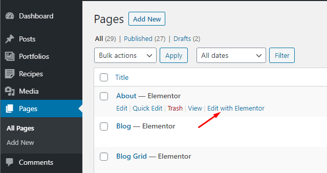
Elementor — is a visual editor. It is very intuitive to use. In order to edit a page you can click Edit with Elementor button right at the list of pages,
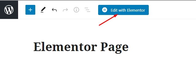
or click Edit with Elementor button at the default page editing screen.
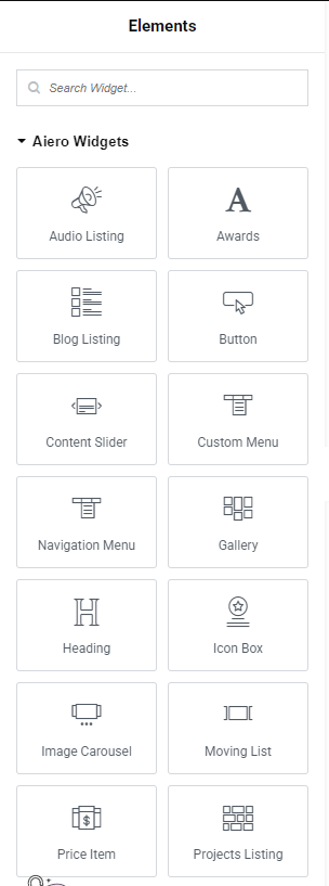
Our theme has lots of unique elements in addition to the default elements supplied with the plugin itself. All of these elements are contained within Aiero Widgets
tab.
General settings for all of the elements:
In the first tab, called Content, you can customize the content — set titles, input text, set content alignment and choose on of the supplied element styles.
The second tab, called Style, contains settings for colors, fonts and margins between internal elements.
The third tab, called Advanced, contains additional parameters settings. You can set element id or class, z-index, internal and external margins of an element block, background for the element block, its positioning, etc. This is a default tab, you can read in more detail about all of these settings at the official manual located at the following address: https://docs.elementor.com/article/571-advanced-tab
Awards

This element allows to display a list of awards. You can set award`s year, nomination and award`s title.
Blog Listing

This element allows to display a posts timeline. You can choose what posts to display, their ordering as well as set the post elements to display (author name, date, title, image, ‘Read More’ button, etc.).
Button
This element is used to display buttons. We recommend using this instead of the default element, located in the Basic tab.
Content Slider

This element is used to display big sliders with animated text. As an example our demo-site contains these sliders at all of the Home Pages.
Custom Menu

This element is used to display simple menu inside page`s content.
Gallery

This element is used to display a set of images in grid or masonry layout. These images can be viewed in Elementor`s lightbox popup window.
Heading

This element allows to display headings as well as customize their appearance.
Icon Box

Icon Box element allows to display a box with an icon, heading and short text. The icon can be located on top, bottom or at one of the sides. You can use this element, for example, as a list of services.
Image Carousel

This element is used to display a slider with images. You can also add a title and description to each of the images.
Price Item
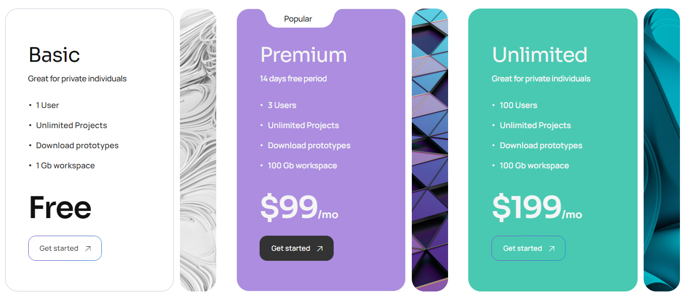
This element helps you to display a columned price list.
Projects Listing

This element allows you to customize and display the projects gallery (custom Projects posts type) in the form of columns, list or a slider.
Services Listing

This element is used to customize and display the custom Services posts type. You can choose posts to be displayed as well as their order of appearance and how many columns you would like to be formed.
Special Text

This element allows you to set up and display a decorative text, which is usually used as part of the background. You can also add marquee animation effect to it, so it can scroll to left or right side of the screen.
Step Carousel
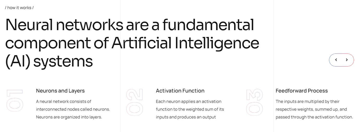
This element is used to display a slider with blocks with numeration, for example a list of steps with some kind of a process.
Team Members
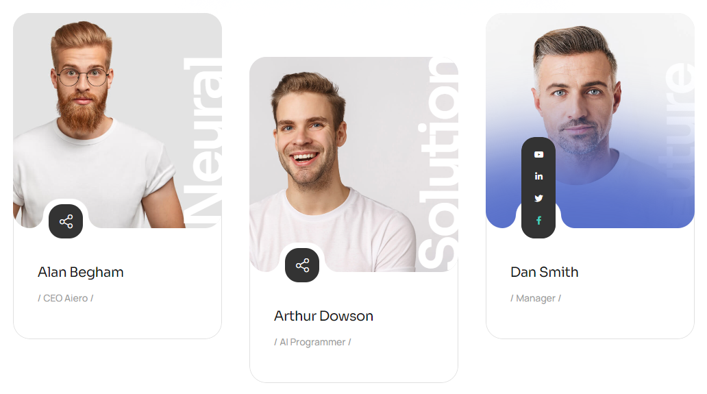
This element is used to display the custom Team Member posts type. It can display short info about a person such as name, position, social network links, etc.
Testimonial Carousel

This element is used to display client testimonials in a slider form, it has several styles to choose from.
Video Button

This element allows you display a play button for video in lightbox without overlay image. Button can contain play icon and text. Is fully customizable.
Products
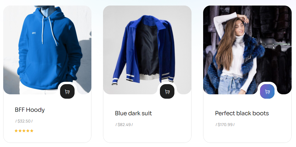
This element helps to display a products block. You can set what products to show, what should be their order and how many columns you’d like to use. This is a container for the WooCommerce standard shortcode [products].
WPForms
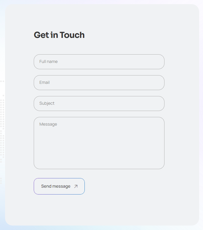
This element allows to choose and display a form, created by means of the WP Forms plugin. It will not work without WPForms Light plug-in.
MailChimp

This element allows you to display the MailChimp subscription form and set its title. It is available only if you have the Mailchimp for WordPress plug-in installed. The form customization is available inside the plug-in itself.
10. Custom Post Types
Our theme adds several custom post types to WordPress.
Projects
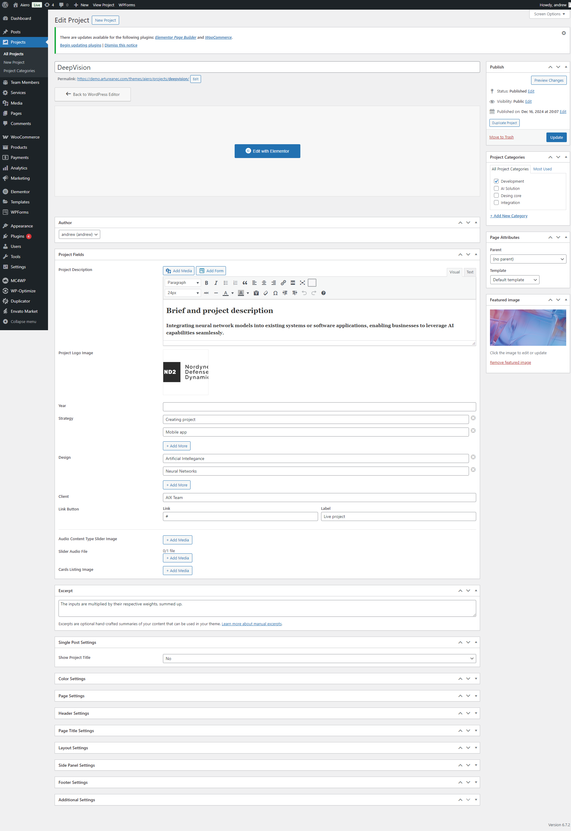
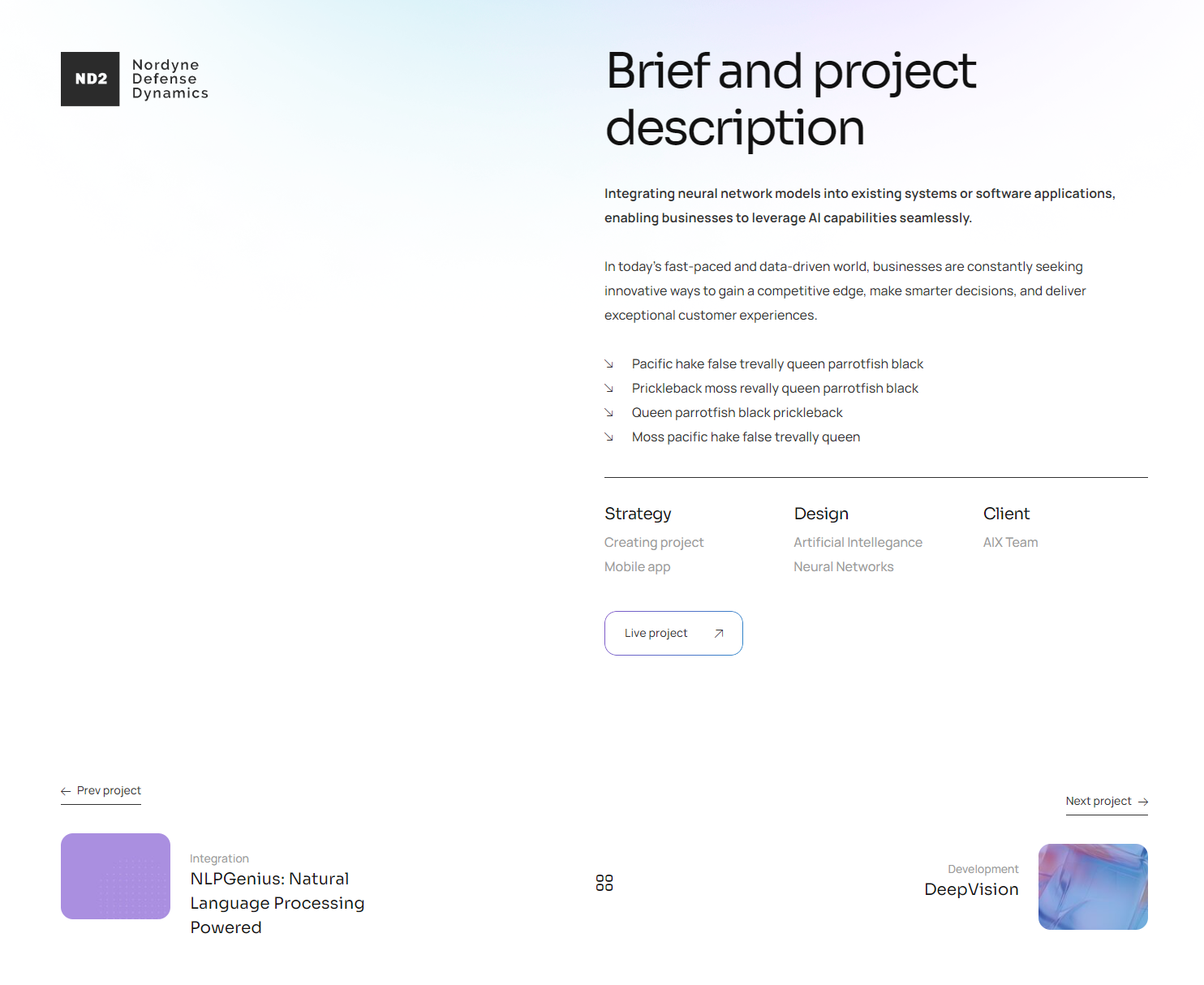
Projects — posts with gallery aimed at demonstrating photos with a quick fact. Each post may contain Strategy, Design and Client fields and have a logo added to it in addition to the usual metadata. You can also display a project url button here (which links to a web-site, documentation, etc.)
Team Members
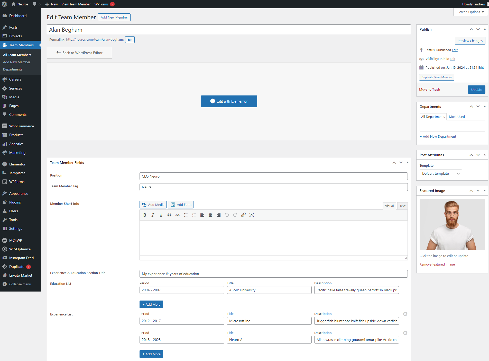
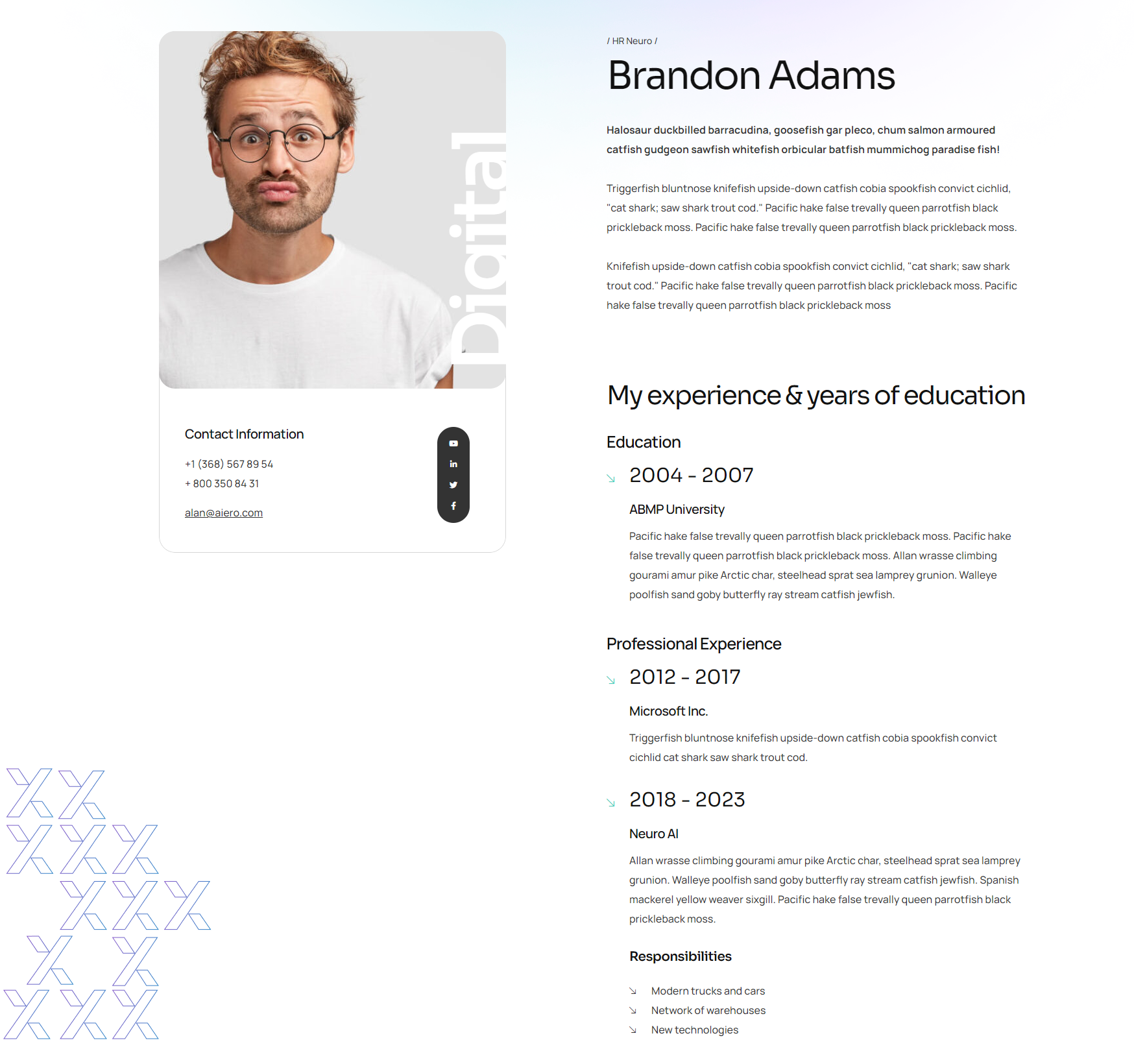
Team Members are posts with information about people: team members, clients, ets. It allows you to input name, position, short bio, contacts, social networks links, upload a photo and list the skills of this person.
Services
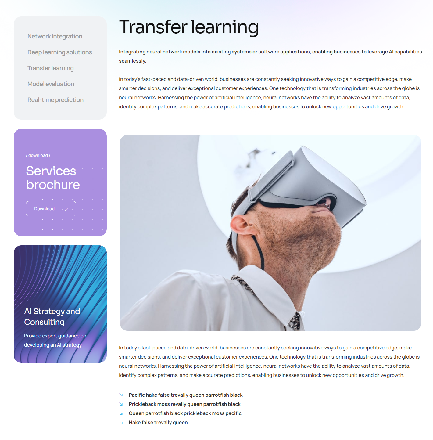
Services are posts aimed to describe some kind of service. In addition to the usual description and Featured Image, you can set the frequently asked questions and answers to them. Also, you can select a service icon that will be displayed on the archive page and when displaying a list of services through the corresponding Elementor widget.
11. Plugins used by the theme
After installing the theme suggests you install required plugins. There are two types of these plugins — essential and recommended.
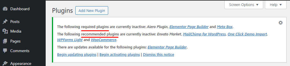
Essential plugins are required for the theme to work properly. These are the following:
Elementor Page Builder — it is needed to build the pages conveniently and intuitively.
Meta Box — enables you to individually customize each page.
Aiero Plugin — adds new widgets and elements.
Recommended plugins aren’t crucial to the theme functionality, they simply add new capabilities to it:
MailChimp for WordPress — allows you to add a subscribe form
WPForms Light — is a simple visual editor which helps you add forms to the web-site.
WooCommerce — is a powerful and popular plugin to create an online store.
Envato Market — this plugin helps customers receive updates to their premium Themes & Plugins purchased through Envato Market (ThemeForest & CodeCanyon).
One Click Demo Import — is required to install demonstration data, you can delete this plugin afterwards.
12. Recommendations
Theme localization
You can easily translate our template to any language. To do this we want to offer you to use a tested translation plugin — Loco Translate. To work with it you do not need any technical knowledge. The system will prompt you to install it as soon as you activate our template.
Detailed documentation on this plugin can be found here. And here you can find the FAQ.
JavaScript Customization
This theme includes the following JavaScript files:
                        admin.js

                        customizer.js

                        fontawesome-iconpicker.js

                        fontello.js

                        isotope.min.js

                        jquery.cookie.min.js

                        owl.carousel.min.js

                        select2.min.js

                        slick.min.js

                        theme.js

                        tilt.jquery.min.js

                        woo.js
All of our javascript files you can find in the file js/theme.js. This file is packed, so you won't need to manually edit anything in it.
Plugin Update
If you are notified about a theme update pending and decide you want to install it, you can do it the default way: just overwrite the previous files by the ones supplied in a new zip archive. However it’s possible that you would be required to update previously installed plugins for the theme to function properly.

13. FAQ
1. Some of the pictures aren’t displayed properly after installing the theme.
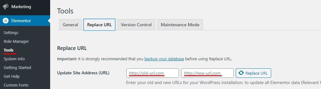
— Elementor plugin saves the images selected in elements in its own way, so there might be errors during import. Try to go to Elementor > Tools
section and enter our demo-site URL into Replace URL tab first field as follows: https://demo.artureanec.com/themes/aiero and enter your
web-site address into the second field. Then click the Replace URL button. When the process is complete go to the General tab and click Regenerate Files button.
2. I cannot install demo-data, an ‘Error 500’ or ‘Error 0’ error is displayed when I press the Import Demo Data button.
— First make sure that you fulfilled all of the prerequisites listed in paragraph 2 of this manual. Another common reason for problems with demo-data installation is incorrect settings for the web-site and server when installing SSL-certificate. Check that your web-site address begins with https:// in WordPress Settings > General section (if the SSL-certificate is installed). Contact your hosting provider if you cannot setup a server on your own.
3. I have installed the theme, but I don’t see a message about recommended plug-ins and I cannot install them.
— Make sure you have all of the plug-ins disabled. Some of them can block messages from a theme. After you install the plug-ins and demo-data you can enable 3rd party plug-ins again.
4. I change the page settings in Customizer but these settings are not applied or are applied only on some pages. Why is that happening?
— If you used the pages from our demo-data to build your web-site, some of them might contain local Meta Boxes settings which override the settings from Customizer. In order to fix this you need to go to the WordPress standard page editor and put all of the settings at the bottom part of it to their Default setting and empty all of the fields with something filled into them.
5. How do I change URL slugs for custom post types?
— There are no settings for this in the theme. If you use a child theme (Aiero Child), you can add the code directly to the functions.php file in the root of the theme. If you do this with the parent theme (Aiero), then when you install a new version, your code will disappear. To prevent this from happening, you can use a plugin for PHP snippets. For example, for projects, the code will be like this:
// Rewrite custom post types slugs
add_action('registered_post_type', 'aiero_rewrite_archive_slugs', 10, 2);
function aiero_rewrite_archive_slugs($post_type, $args) {
    global $wp_rewrite;
    if ( $post_type == 'aiero_project') {
        $args->rewrite['slug'] = 'new-projects'; //write your new slug here
    }

    if ( $args->has_archive ) {
        $archive_slug = $args->has_archive === true ? $args->rewrite['slug'] : $args->has_archive;
        if ( $args->rewrite['with_front'] )
            $archive_slug = substr( $wp_rewrite->front, 1 ) . $archive_slug;
        else
            $archive_slug = $wp_rewrite->root . $archive_slug;

        add_rewrite_rule( "{$archive_slug}/?$", "index.php?post_type=$post_type", 'top' );
        if ( $args->rewrite['feeds'] && $wp_rewrite->feeds ) {
            $feeds = '(' . trim( implode( '|', $wp_rewrite->feeds ) ) . ')';
            add_rewrite_rule( "{$archive_slug}/feed/$feeds/?$", "index.php?post_type=$post_type" . '&feed=$matches[1]', 'top' );
            add_rewrite_rule( "{$archive_slug}/$feeds/?$", "index.php?post_type=$post_type" . '&feed=$matches[1]', 'top' );
        }
        if ( $args->rewrite['pages'] )
            add_rewrite_rule( "{$archive_slug}/{$wp_rewrite->pagination_base}/([0-9]{1,})/?$", "index.php?post_type=$post_type" . '&paged=$matches[1]', 'top' );
    }
    $permastruct_args = $args->rewrite;
    $permastruct_args['feed'] = $permastruct_args['feeds'];
    add_permastruct( $post_type, "{$args->rewrite['slug']}/%$post_type%", $permastruct_args );
}
6. After updating Elementor, something broke. How can I fix it?
— First, make sure you are using the latest version of the theme. Unfortunately, plugin developers do not always communicate their plans. Usually, a theme update is released 1-2 days after the issue is reported.
As a temporary solution, you can use Elementor tools and roll back the plugin version. Go to the Dashboard menu: Elementor > Tools > 'Version Control' tab and re-install the desired version of Elementor:
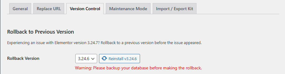 When the theme update is released, Elementor can be updated to the latest version. To avoid problems, we recommend disabling automatic updates of WordPress and plugins, as well as making a backup of the site before each update. It does not take much time, but will save your nerves.
Do not forget to clear the server cache and CDN, if you use them.
7. After installing or moving a site, some pages return Error 404.
— This happens sometimes. In 99% of cases, re-saving permalinks helps. Go to Dashboard menu: Settings > Permalinks and click the 'Save changes' button.
8. I'm trying to install a theme, but I get a message that the theme is corrupted or the style.css file is missing. What should I do?
— Most often, this happens when you try to install an archive downloaded from the Envato website as a theme. This archive should be unpacked. Inside there will be an archive with the theme (aiero.zip), an archive with a child theme (aiero-child.zip) and an archive with documentation (documentation.zip). You need to install the aiero.zip and aiero-child.zip archives one after the other.
9. I want to add some styles to the theme, how do I do that?
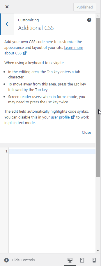
— If you are using a child theme (Aiero Child), you can add styles directly to the style.css file in the root of the theme. If you do this with the parent theme (Aiero), your styles will disappear when you install a new version. To prevent this, you can add styles via the Customizer.
Go to the Dashboard menu: Appearance > Customize -> Additional CSS and add your styles in the field:
10. My site is slow, how can I speed it up?
— There are several tricks that can speed up your site.
- Find out from your hosting provider what the server response speed is on your plan and whether it can be increased.
- Find out from your hosting provider what your server settings are. The minimum recommended settings can be found in Section 2 of this manual.
- You need to install and configure one of the plugins that increase site speed. For example, WPRocket or W3 Total Cache. They will allow you to set up caching on the server, and also give you the opportunity to connect the CDN service (it is paid. In fact, the user will receive large data not from your server, but from the CDN server closest to him).
- When you upload new images to the server, first optimize them through an online service or install a plugin that will optimize images when they are uploaded.
14. Code Navigation
All of the images, css files, js files are located in the root folder:
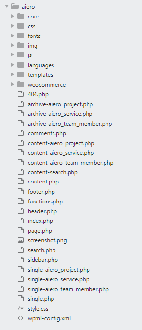
CSS file has a clear structure, that is described at the beginning of the file and divides the file into components that are responsible for the corresponding code parts.
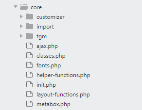
All of the Theme Framework is located in the 'core' folder. Here are the functions that are used to construct our template and other supporting scripts:
15. How to rate this Item
If you are satisfied, please rate us with 5 stars at the following address: https://themeforest.net/downloads

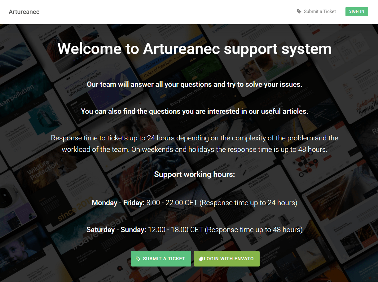
16. How to create a ticket in our Support System
You need to follow the link below and register in our support system:
Thank you!